This module is configured to be displayed in the topbar position.

Slider position

This module is configured to be displayed in the slider position.  You will get best results by setting up redSLIDER here.  The correct width for the slider or image you place here is 1170px.

Grid-Top position

This module is configured to be displayed in the grid-top position.  This position is a flex-grid, so it can accomodate from 1 to 6 modules, and it will automatically distribute the horizontal space for all the modules in this position, for desktop-like devices.

Grid-Top position

This module is configured to be displayed in the grid-top position.  This position is a flex-grid, so it can accomodate from 1 to 6 modules, and it will automatically distribute the horizontal space for all the modules in this position, for desktop-like devices.

Grid-Top position

This module is configured to be displayed in the grid-top position.  This position is a flex-grid, so it can accomodate from 1 to 6 modules, and it will automatically distribute the horizontal space for all the modules in this position, for desktop-like devices.

Grid-Tab position: Tab 1

This module is configured to be displayed in the grid-tab position.  This position can accomodate several modules, placing each one in a different tab - try clicking on the tabs above to switch from one module to another.

This is the first tab.

Grid-Tab position: Tab 2

This module is configured to be displayed in the grid-tab position.  This position can accomodate several modules, placing each one in a different tab - try clicking on the tabs above to switch from one module to another.

This is the second tab.

Grid-Tab position: Tab 3

This module is configured to be displayed in the grid-tab position.  This position can accomodate several modules, placing each one in a different tab - try clicking on the tabs above to switch from one module to another.

This is the third tab.

Above-Content position

This module is configured to be displayed in the above-content position, which is just above the content, but into the sidebars, if they are present in the page.

This page demonstrates the module positions included for this template.  Click here to do an x-ray of the module positions, viewing them in preview mode.  You can also see them in the map included below.
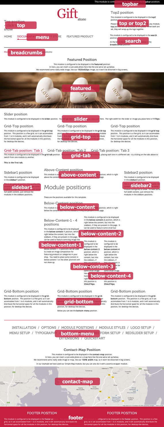
Module Position Map

Below-Content position

This module is configured to be displayed in the below-content position, which is just below the content, but into the sidebars, if they are present in the page.

Below-Content-1 - 4 positions

This module is configured to be displayed in the below-content-1 position, which is just below the content, but into the sidebars, if they are present in the page.  It can be used to feature some big image like we did in the home page.  The correct image size in this position is 768x808.

below-content-1 - 4 positions can be used to create an image composition for featuring products or categories in your shop.  You need to place some content in below-content-1 or the other positions will not show up.

This module is configured to be displayed in the below-content-2 position, which is just below the content, but into the sidebars, if they are present in the page.  It can be used to feature some small but wide image like we did in the home page.  The correct image size in this position is 768x385px.

This module is configured to be displayed in the below-content-3 position, which is just below the content, but into the sidebars, if they are present in the page.  It can be used to feature some small image like we did in the home page.  The correct image size in this position is 354x374px.

This module is configured to be displayed in the below-content-4 position, which is just below the content, but into the sidebars, if they are present in the page.  It can be used to feature some small image like we did in the home page.  The correct image size in this position is 354x374px.

Contact-Map Position

This module is configured to be displayed in the contact-map position.
In here, you can insert a cute wide photo or a map like the one we've set up below.
We recommend some really wide image or map, like our 100% width map, so it won't be distorted in big screens.

In our example we have used our Simple Map module, but you can also do it with a Joomla wrapper module.

Grid-Bottom position

This module is configured to be displayed in the grid-bottom position.  This position is a flex-grid, so it can accomodate from 1 to 6 modules, and it will automatically distribute the horizontal space for all the modules in this position, for desktop-like devices.

Grid-Bottom position

This module is configured to be displayed in the grid-bottom position.  This position is a flex-grid, so it can accomodate from 1 to 6 modules, and it will automatically distribute the horizontal space for all the modules in this position, for desktop-like devices.

Below you can see the bottom-menu position.

Grid-Bottom position

This module is configured to be displayed in the grid-bottom position.  This position is a flex-grid, so it can accomodate from 1 to 6 modules, and it will automatically distribute the horizontal space for all the modules in this position, for desktop-like devices.